Responsive Web Design

Perfect on Every Device

Ensure your website looks perfect on all devices. Our responsive design approach guarantees optimal viewing experiences across desktops, tablets, and smartphones, keeping your users engaged no matter how they access your site.
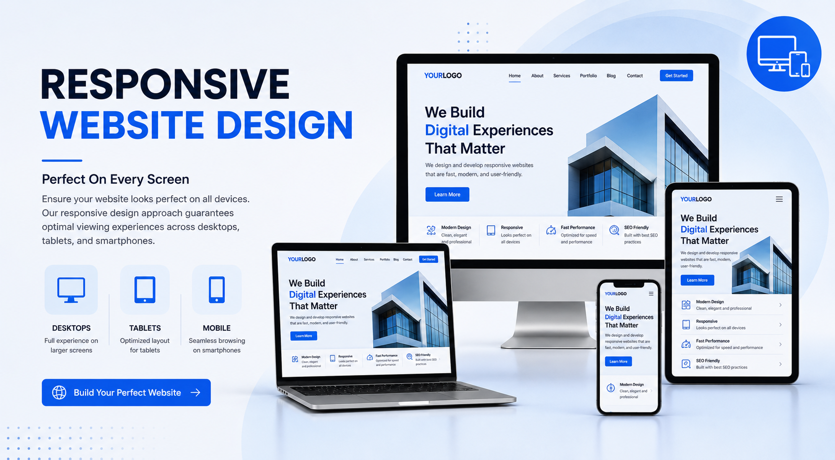
Responsive Design

What We Offer

In today's multi-device world, responsive design is no longer optional—it's essential. Over 60% of web traffic comes from mobile devices, and users expect seamless experiences regardless of screen size.

Our responsive design services ensure your website automatically adapts to any device, providing an optimal viewing experience. We use flexible grids, layouts, and CSS media queries to create websites that look and perform beautifully everywhere.

Key Features

📱

Mobile-First Approach

Design optimized for mobile devices first, then scaled up.

🖥️

Fluid Grids

Flexible layouts that adapt to any screen size smoothly.

🖼️

Flexible Images

Images that scale perfectly without losing quality.

Fast Loading

Optimized performance for quick load times on all devices.

👆

Touch-Friendly

Buttons and navigation optimized for touch interactions.

🔍

SEO Benefits

Google prefers mobile-friendly websites in search rankings.

Why Responsive Design Matters

📊

Increased Reach

Access customers on all devices, expanding your audience significantly.

💰

Cost Effective

One website that works everywhere, instead of multiple versions.

📈

Better Conversions

Users are more likely to convert when experience is seamless.

🛠️

Easy Maintenance

Single codebase makes updates and maintenance simpler.

Our Approach

We follow a comprehensive responsive design methodology:

1️⃣

Device Analysis

Research your audience's device usage patterns.

2️⃣

Mobile-First Design

Create designs starting from the smallest screen size.

3️⃣

Progressive Enhancement

Add features and layouts for larger screens gradually.

4️⃣

Testing & Optimization

Rigorous testing across multiple devices and browsers.